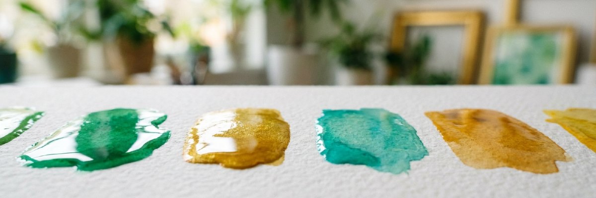
Not all paints are created equal. Pigment quality, transparency, and choosing the right brand directly impact your watercolor experience — a complete guide with Şirvan Hoca's recommendations.
Not all paints are created equal.
One of the most common mistakes made when starting to learn watercolor is thinking that all paints are the same. There's a wide range of paints, from cheap sets sold in supermarkets to professional workshop paints — and the difference isn't just price, it means a completely different experience.
Low-quality paint contains little pigment, the colors are pale and dull, and they become muddy when mixed. High-quality paint, on the other hand, gives vibrant, transparent, and deep colors — that unique watercolor effect, using the whiteness of the paper as a light source, can only be achieved with good pigment. For years, Şirvan Hoca observed in her workshop that students who use the wrong paint, no matter how correctly they apply the technique, will not achieve the desired result and will be disappointed. This guide was prepared precisely to prevent you from experiencing that disappointment.
What is pigment and why is it important?
The most fundamental element determining the quality of watercolor paint is the pigment. Pigments are microscopic particles that give paint its color — the purer and denser they are, the more vibrant, transparent, and permanent the color will be.
Lightfastness — Color Fastness
This indicates whether the paints fade when exposed to light for a long time. In professional series, each color has a lightfastness value such as I or II — I means the most permanent, III the most fade-prone. You don't need to worry too much about it at first, but it becomes an important criterion as you progress. Transparency
Transparency is everything in watercolor. Transparent paint lets the whiteness of the paper through, creating a luminous and deep effect. Opaque paint is covering, concealing the underlying layer. Some colors are naturally more opaque — it is important to know this when using them. Granulation
Some pigments leave small particles on the surface of the paper — this is called granulation. It is seen in rock, earth, and some mineral pigments. Some artists like this texture, others avoid it. It is easier to work with paints that have less granulation at first. Single Pigment or Mixture?
Whether the paint contains a single pigment or multiple pigments directly affects color mixing. Single-pigment paints produce clean, vibrant colors when mixed. Paints containing multiple pigments are more prone to muddling. In professional series, this information is usually printed on the paint tube.
Transparent and Opaque Paints: Which One to Use When?
Transparency is one of the most fundamental concepts in watercolor. Not all colors have the same level of transparency — some colors are naturally transparent, some are translucent, and some are opaque. Knowing this makes color layering and blending much more conscious. Transparent Colors
They allow the underlying layer and the whiteness of the paper to pass through. As they are layered, they create depth and richness. That luminous, bright effect characteristic of watercolor is achieved with transparent colors. Phthalo blue, quinacridone red, and Hansa yellow are the best examples of transparent colors. Translucent Colors
They possess both transparency and opacity. They are frequently used in transition areas and color balancing studies. Many earth tones fall into this category. Opaque Colors
They cover the underlying layer and suppress the whiteness of the paper. In watercolor, opaque colors must be used consciously — if used in the wrong place, they destroy that vibrant watercolor feel. Cadmium yellow and cadmium red are the most common examples of opaque colors. Practical Rule
Work from light to dark, from transparent to opaque. In watercolor, the best approach is to start with translucent colors and gradually deepen them—once an opaque color is applied, it's impossible to bring the gold back.
Student Series or Professional Series?
Watercolor paints are divided into two main categories. The difference between them is not just the price — pigment density, colorfastness, transparency, and mixing performance also differ. Student Series
Contains less pigment and more filler. The colors may be slightly paler and less translucent. But it is more than enough for learning technique, experimenting, and practicing. Being able to work freely without dipping your brush in expensive paper and paint is a great freedom at the beginning. Professional Series
Offers high pigment density, superior colorfastness, and deep transparency. Intense, vibrant colors are obtained with less paint. You will feel this difference both visually and in your brush as your technique matures.
Recommended Beginner Brands by Şirvan Hoca
Four series can be confidently recommended for beginners:
Winsor & Newton Cotman — The most widely available series with the strongest price/quality balance. It is the most preferred beginner series worldwide.
Van Gogh — Stands out with its vibrant colors and wide palette options. The pigment quality is quite good within the student series.
Daler Rowney Aquafine — An economical but reliable series that does not compromise on quality. It offers an ideal price/performance balance for beginners.
St. Petersburg White Nights — The series that comes closest to professional quality at a cost close to the student series price. It is a valuable option for those who can stretch their budget a little. When to Switch to the Professional Series?
Switching to the Daniel Smith, Schmincke, or Winsor & Newton Professional series becomes meaningful when you can comfortably mix colors, layer, and control water. At that point, you will feel the difference in quality very clearly.
Starter Palette: Are 12 Colors Enough?
One of the common mistakes beginners make is starting with too many colors. Getting lost among dozens of colors is both confusing and prevents learning how to mix colors. Professor Şirvan's approach is clear: start with a few colors, learn to mix, and expand over time.
6 Basic Colors — The Beginning of Everything
Theoretically, it is possible to obtain every shade with 6 basic colors: warm yellow, warm red, cool blue, brown, green, and black. Learning to mix these 6 colors is the most solid foundation of color theory.
12 Colors — The Ideal Starter Set
In practice, 12 colors are ideal for beginners. Adding a few ready-made blended colors alongside the 6 basic colors saves time and allows for a faster start to the work. Most beginner series are sold as a 12-color set — this is no coincidence. Colors to Avoid
In the beginning, stay away from very opaque colors — such as cadmium yellow, cadmium red. These colors cover other layers and spoil the transparent effect characteristic of watercolor. Also, very granular colors can be difficult to control initially.
Should I Use White?
Using white paint in watercolor is traditionally not preferred — light areas are achieved while preserving the whiteness of the paper. Adding white makes the paint opaque and changes the character of the watercolor. Leave white out of the palette initially.
Should I Use Black?
Black paint can easily contaminate colors in mixtures. For dark tones, a mixture of dark navy and brown gives much richer results instead of black. You should use black carefully and sparingly.
Tube dye or tablet dye?
Watercolor paints are sold in two formats: tubes and tablets (pans). Both contain the same pigment — the difference lies in the method of use and practical application.
Tablet Paint (Pan)
Sold in small, solid formats in ready-to-use boxes. Easy to carry, doesn't spill, ready to use at any time. Ideal for artists who travel, paint outdoors, and work in small formats. The vast majority of beginner sets are in tablet format.
Disadvantage: It takes some time to wet the brush and take paint from the tablet. It can be difficult to collect enough paint in large areas.
Tube Paint
Sold in tubes with a paste-like consistency. It is opened by squeezing it onto the palette. Much more practical when you need to collect a large amount of paint in large areas. It is also easier to adjust the color intensity.
Disadvantage: If the mouth of the tube is not properly closed once opened, it will dry out. Less practical to carry compared to tablets.
Which for Beginners?
Both are suitable for beginners. Professor Şirvan's observation is this: tablet sets are more practical for beginners — ready-made box, ready-made palette, you can start immediately. The transition to tube paint naturally comes with the shift to large-format work.
Using Tablet Paint Like a Tube
If you moisten a tablet paint with a few drops of water and let it sit for a few minutes, you'll get a consistency similar to a tube paint. This little trick makes your work easier when working on large areas.
Professor Şirvan's Practical Method
Professor Şirvan and his students use both tube and tablet formats. Tube paints — especially the Daniel Smith series — are used by squeezing them into empty or depleted tablet slots. In this way, you benefit from both the color intensity and abundance of the tube and the practicality of the tablet at the same time. Over time, creating your own palette in this way is both an economical and personal experience.
Color Mixing: Ways to Avoid Mud
One of the most common complaints in watercolor painting is the muddiness of colors. Instead of vibrant, clean colors, a dirty, matte result often stems from color mixing errors, not technical mistakes. Why Does It Muddy?
Mixing multiple opaque colors together, combining too many colors at once, and working with dirty brushes or dirty water are the main reasons for muddiness. The risk increases as you go beyond two colors — mixing three colors already requires care, four almost always results in muddiness. Golden Rules for Clean Colors
Mix a maximum of two colors on the palette. Wash your brushes thoroughly after each color change. Change your water container frequently — dirty water affects all colors. Prefer working with translucent colors, avoid opaque colors. Mixing Colors on Paper
Instead of mixing on the palette, combining colors directly on paper gives much more vibrant results. In the wet-on-wet technique, apply two colors separately to wet paper — the paint blends naturally on the paper, creating those organic, vibrant transitions. This is one of the most beautiful effects unique to watercolor painting. For Neutral Tones
Opposite colors — complementary colors — create beautiful neutral and earthy tones when mixed together. Like orange and blue, purple and yellow, red and green. This method produces much richer and deeper dark tones than using black paint.
Frequently Asked Questions About Watercolor Paints
Can dried paint be reused?
Yes — this is one of the most practical features of watercolor. Tablet paints are already in dry format and are reactivated with a few drops of water. Tube paints, even if they dry on the palette, soften and become usable again by adding a few drops of water and letting them sit. Never throw away any of your paints.
What is the difference between watercolor and gouache?
Gouache is similar to watercolor but is opaque — it completely covers the paper, not showing what's underneath. Watercolor, on the other hand, is transparent, using the whiteness of the paper as a light source. They are technically different mediums. White gouache can be used occasionally to add points of light in watercolor work.
How long does the paint last?
High-quality watercolor paints have a very long shelf life — they can be used for years if stored properly. Keep away from direct sunlight and excessive humidity or heat. Make sure the tube of paint is tightly closed.
Which colors should I learn first?
Start with the primary colors: yellow, red, and blue. Practice mixing these three colors, learning how to obtain secondary colors. Experiencing color theory firsthand on paper is the most lasting method of learning. Why are different shades of the same color so different? Cobalt blue and Prussian blue may look like the same "blue," but they are entirely different pigments — their transparency, granulation, and mixing behavior are vastly different. Getting to know the personality of each color over time is the most enjoyable part of the watercolor journey.
Recommended Paint Sets
Recommended paint kits will be here soon!
You've chosen your paints, now start painting!
Choose the right paint, transfer your first color onto paper.
We've compiled all the paint sets recommended by Şirvan Hoca on a single page. You can browse all options, from beginner to advanced levels, and easily find the set that suits you.